Short-term results are underwhelming, while longer-term returns outperform
For the longest time, bond yields were higher than stock yields, and that was accepted as the natural order of things. Stocks offer the chance for higher returns through stock price appreciation. One downside was thought to be a reduced stream of income, but that all changed after the financial crisis. Since then, we have seen ultra-low interest rates, commonly below stock yields.
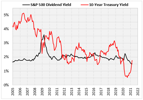
The chart below compares the yield on the 10-Year Treasury note to the dividend yield on the S&P 500 Index (SPX). In mid-2020, the yield on the Treasury note hit its lowest level ever. Its upward trajectory has accelerated recently, spiking back above the dividend yield of stocks. As bond yields increase, stocks become less attractive. This week, I’m looking at how stocks have performed after the 10-year Treasury note yield overtakes the yield on SPX stocks.

The Prior Signals
Using monthly figures since 1953 (as far back as we have data on the 10-year Treasury note), the table below lists occurrences when the bond yield moved above the dividend yield on SPX stocks. Five of the seven signals happened after the 2009 financial crisis' bottom. The results are mixed, with short-term results underperforming, but longer-term returns outperforming.
Ignoring the first two rows that contain 1950s results, one month after these instances you get three negative returns, one that’s flat, and just one decent return. Three months later, you get two returns that beat the overall average, one near breakeven, and two negative returns, including a 20% loss in the first part of 2020.
Based on this, perhaps a less appealing dividend yield is a catalyst for a stock market selloff. The six and 12-month returns, however, tell a different story. The average six-month return after theses instances beat the typical return for the SPX (4.72% vs. 4.36%). A year after the latest five occurrences, stocks were higher by double digits every time.

Finally, here’s a chart going back to 2007, showing the SPX, along with the difference in the dividend yield and 10-year Treasury note yield. The one signal at the end of 2019 was a short-term disaster. Other than that, the other signals seem to occur at random times during the uptrend. Nothing here looks concerning, even though the numbers above (only five recent signals) suggest short-term weakness.
